So . . . I am happy to post today about a site that does it right--ShopIttoMe.com. Here are some of the highlights (which can be adopted and adapted by your webmasters as well):
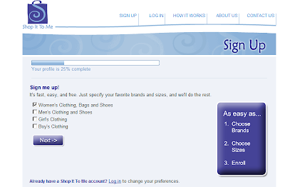
1. Users are motivated by a sense of accomplishment from the first step. On the sign-up page, the major heading (see below) reads "Your profile is 25% complete," although the user has done nothing but navigated to that screen. Pretty smart, huh?

2. Users know what they can expect in terms of process from the first step. The call-out box (above) reads: "It's as easy as (1) choose brands, (2) choose sizes, (3) enroll." Preparation and managing expectations are key in the user engagement process.
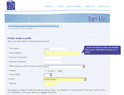
3. Users are told why certain fields are being required. The savvy addition of pop-ups (see below) that answer the question "Why?" builds trust and confidence for any skeptics and guards against the second-guessing that can lead to increased abandonment and bounce rates.

4. Users are educated about what's next in a simple, branded completion screen. Because a confirmation email is sent, users are directed to check their email (as well as their spam folder) and provided with instructions in case they don't receive an email within--get this!--a specified timeframe of 5 minutes. This language helps ensure complete follow-through at a stage where many can abandon. (No screen shot on this one.)
All in all, ShopIttoMe has a stellar user experience design for the sign-up process. If your processes need a boost,


No comments:
Post a Comment