Web analytics, we all know, are key to measuring the success of online marketing efforts. And there certainly is plenty to look at! Metrics can be overwhelming, so many small business marketers or micro-business owners turn to outside help. I read a very astute recommendation for those looking to hire a web analytics person from Larry Chase's Web Digest for Marketers. It's a comment from Eric Peterson, founder and CEO of Web Analytics Demystified, Inc.; he says:
"The essential thing is that you need someone who is analytically minded and curious, who will define and follow a process and will keep digging for answers, even beyond the first set of numbers," he said.
Thanks, Larry, for the informative e-mail newsletters (I love getting them!) and for the timely and pertinent interview with Eric T. Peterson.
Showing posts with label website development. Show all posts
Showing posts with label website development. Show all posts
Tuesday, January 20, 2009


Tuesday, December 23, 2008
Praise for a Sign-up Process and Experience: ShopIttoMe.com
It's not everyday that I encounter a site with a sign-up process that is easy to use, branded, and all around fun. In fact, one of my service offerings, the site review, includes testing such processes and finding room for improvement to increase lead generation and sales for small business clients. (You can also check out my handy recommended steps for reviewing your site yourself here.)
So . . . I am happy to post today about a site that does it right--ShopIttoMe.com. Here are some of the highlights (which can be adopted and adapted by your webmasters as well):
1. Users are motivated by a sense of accomplishment from the first step. On the sign-up page, the major heading (see below) reads "Your profile is 25% complete," although the user has done nothing but navigated to that screen. Pretty smart, huh?
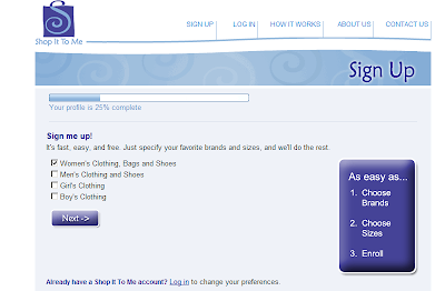
2. Users know what they can expect in terms of process from the first step. The call-out box (above) reads: "It's as easy as (1) choose brands, (2) choose sizes, (3) enroll." Preparation and managing expectations are key in the user engagement process.
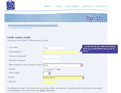
3. Users are told why certain fields are being required. The savvy addition of pop-ups (see below) that answer the question "Why?" builds trust and confidence for any skeptics and guards against the second-guessing that can lead to increased abandonment and bounce rates.
4. Users are educated about what's next in a simple, branded completion screen. Because a confirmation email is sent, users are directed to check their email (as well as their spam folder) and provided with instructions in case they don't receive an email within--get this!--a specified timeframe of 5 minutes. This language helps ensure complete follow-through at a stage where many can abandon. (No screen shot on this one.)
All in all, ShopIttoMe has a stellar user experience design for the sign-up process. If your processes need a boost,
So . . . I am happy to post today about a site that does it right--ShopIttoMe.com. Here are some of the highlights (which can be adopted and adapted by your webmasters as well):
1. Users are motivated by a sense of accomplishment from the first step. On the sign-up page, the major heading (see below) reads "Your profile is 25% complete," although the user has done nothing but navigated to that screen. Pretty smart, huh?

2. Users know what they can expect in terms of process from the first step. The call-out box (above) reads: "It's as easy as (1) choose brands, (2) choose sizes, (3) enroll." Preparation and managing expectations are key in the user engagement process.
3. Users are told why certain fields are being required. The savvy addition of pop-ups (see below) that answer the question "Why?" builds trust and confidence for any skeptics and guards against the second-guessing that can lead to increased abandonment and bounce rates.

4. Users are educated about what's next in a simple, branded completion screen. Because a confirmation email is sent, users are directed to check their email (as well as their spam folder) and provided with instructions in case they don't receive an email within--get this!--a specified timeframe of 5 minutes. This language helps ensure complete follow-through at a stage where many can abandon. (No screen shot on this one.)
All in all, ShopIttoMe has a stellar user experience design for the sign-up process. If your processes need a boost,
Thursday, November 6, 2008
Recommended Reading: The Elements of User Experience
Every once in a while I come across a resource that is so astute yet so easy to absorb that I want to shout about how wonderful it is--and that is how I feel about Jesse James Garrett's book, The Elements of User Experience.
In searching for a reliable, professional resource for the user-centered design of websites, I came across mention of--and many links for--this diagram called The Elements of User Experience (published 30 March 2000). I was a bit skeptical, I admit, but mostly because I expected many more authors on the subject who were (er, um) not necessarily consultants, as well as something more current.
Little did I know that it's the nature of the field since the web began. There seems to be relatively few experts at the macro-level and limited recognition or understanding of the user experience design field at-large among my network of designers and engineers. But after practically devouring his book, I am convinced Mr. Garrett is the guru.
From his clear breakdown of all that's involved and the division between two communities--technical software designers and information scientists--and their distinct terminologies and approaches, it's no wonder that we might be familiar with portions of the web development process and the titles of those who perform those functions (e.g., information architect, content developer, business analyst) as well as the outcomes (e.g., functional specification, sitemap, architecture diagram, wireframe, etc.) without really being able to understand the big picture.
Thank you Jesse James Garrett for pulling it all together! Your book is an incredible resource and one I highly recommend to anyone creating or revising their site . . . and your blog is pretty clever too. (The only thing I wish for is a glossary of all the terms should you or one of your known accomplices be up for the task!)
. . . And anyone who doesn't want to read the book can just hire me to assemble a team to apply the elements to their site in order to ensure happy users. :)
In searching for a reliable, professional resource for the user-centered design of websites, I came across mention of--and many links for--this diagram called The Elements of User Experience (published 30 March 2000). I was a bit skeptical, I admit, but mostly because I expected many more authors on the subject who were (er, um) not necessarily consultants, as well as something more current.
Little did I know that it's the nature of the field since the web began. There seems to be relatively few experts at the macro-level and limited recognition or understanding of the user experience design field at-large among my network of designers and engineers. But after practically devouring his book, I am convinced Mr. Garrett is the guru.
From his clear breakdown of all that's involved and the division between two communities--technical software designers and information scientists--and their distinct terminologies and approaches, it's no wonder that we might be familiar with portions of the web development process and the titles of those who perform those functions (e.g., information architect, content developer, business analyst) as well as the outcomes (e.g., functional specification, sitemap, architecture diagram, wireframe, etc.) without really being able to understand the big picture.
Thank you Jesse James Garrett for pulling it all together! Your book is an incredible resource and one I highly recommend to anyone creating or revising their site . . . and your blog is pretty clever too. (The only thing I wish for is a glossary of all the terms should you or one of your known accomplices be up for the task!)
. . . And anyone who doesn't want to read the book can just hire me to assemble a team to apply the elements to their site in order to ensure happy users. :)
Wednesday, August 27, 2008
Time for a New Term: URL Sprawl
URL SPRAWL(pron. "earl \ˈsprol\"): The tendency for small businesses to add pages and pages of content to their sites, for a number of reasons, including but not limited to cluelessness, "more is better" mentality, lack of strategic content planning and delivery, and lack of audience awareness. The problem with URL Sprawl is it is not only difficult to find information buried within the site but also that it can overwhelm busy online researchers in search of simple answers. I'll be exploring this concept and others--and of course helping you avoid them--in a new white paper, "Doing (Small) Business on the Web," available on my website in September. Stay tuned!
Wednesday, February 13, 2008
Building a Customer-Friendly Website with 2.0
Trying to decide which new features to include in your site? Not even sure of your options? Look to your customer demographics to guide you. While all users will require an easy-to-navigate site, here are the key features valued most by demographic based on a recent analyst survey:
• Baby Boomers. Easy does it: Limited content and functionality.
• Boomers on the edge. Keeping up with the Joneses: User ratings, reviews, and price comparisons.
• Gen X. Talk about the passion: Discussion boards and profile creation.
• Gen Y. I like that: Games, quizzes and questions, profile creation, personalizing the site, and uploading content.
Overall, the preferences of Gen Y’ers (18-27) were the least requested functionalities within the study. So while you can’t please all the people all the time, your dollars are best spent incorporating the more mainstream technologies, plus the occasional special offer, if your market consists of multiple demographics and/or if you are unsure.
For best results, implement tools to collect primary market data, if you haven’t already, as this information will be a boon in driving all of your marketing decisions.
In additon to ease of use, consider applicability as a general guideline. Since most Internet users are seeking content—not e-commerce—regardless of your industry you would be wise to include educational/informative materials, even if this is not your primary product. If you are selling services, the production of content that positions you as an expert, including links to online articles you author, would be a good use of your time—and a no-cost marketing strategy to boot.
• Baby Boomers. Easy does it: Limited content and functionality.
• Boomers on the edge. Keeping up with the Joneses: User ratings, reviews, and price comparisons.
• Gen X. Talk about the passion: Discussion boards and profile creation.
• Gen Y. I like that: Games, quizzes and questions, profile creation, personalizing the site, and uploading content.
Overall, the preferences of Gen Y’ers (18-27) were the least requested functionalities within the study. So while you can’t please all the people all the time, your dollars are best spent incorporating the more mainstream technologies, plus the occasional special offer, if your market consists of multiple demographics and/or if you are unsure.
For best results, implement tools to collect primary market data, if you haven’t already, as this information will be a boon in driving all of your marketing decisions.
In additon to ease of use, consider applicability as a general guideline. Since most Internet users are seeking content—not e-commerce—regardless of your industry you would be wise to include educational/informative materials, even if this is not your primary product. If you are selling services, the production of content that positions you as an expert, including links to online articles you author, would be a good use of your time—and a no-cost marketing strategy to boot.
Subscribe to:
Posts (Atom)


